 Article
Measuring Zone 2 Training Effectiveness
By: Scott Johnston
Posted:
Having some tools for measuring your Zone 2 training effectiveness is not only fun for data nerds, it can be highly motivating and help you know when to take the next step in your training.
The information contained in this article is provided as a supplement to the Evokecast episode #58 https://www.buzzsprout.com/2065266/14102408 with Joey Wilson of Salt Lake City, Utah. Joey followed the training principles laid out in Training for the Uphill Athlete over the course of 3 years. Using a high volume of Zone 2 training Joey saw massive gains in his performance. The following graphs were kindly supplied by Joey to illustrate graphically the methods he used when tracking aerobic fitness progress.
Joey is a data scientist so don’t feel you need to do all these things. The point here is to demonstrate with several different methods his improved performance by using our training methods.
We’ll start by looking at some of Joey’s performance data.
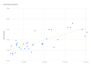
In the podcast Joey explained how he used his time on a section of a trail near his home in Salt Lake City (Freedom Hills) to gage the improvement in his aerobic pace. In the graph above Joey used a novel approach of calculating how far he went on this climb in each beat of his heart. The yellow line is what is called a “best fit” to the scattered data. It is typical in data that it does not conform to a perfectly linear progression but the best fit line here shows that the trend in his performance was positive.
You can do a similar(and simpler) thing by doing what we call and Aerobic Threshold Time Trial. Find a piece of trail ( between 10 and 30minutes long) that you visit frequently and monitor your time to cover a section of it while maintaining your heart rate as close to your Aerobic Threshold as you can. Joey’s aerobic threshold time trial speed improvement is shown in the following graph.
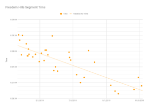
This graph shows the progress Joey made in his Freedom Hills segment. It is worth noting that there were some good days where his times were faster than the trend line like those shown in early September, and there were a few days when he was considerably slower than the trend line. This is what you would expect. We are not machines. We have good days and bad days. Expecting to set a new personal best each time you test is a recipe for both disappointment and may induce you to push above your aerobic threshold in order to beat your old best time. That defeats the purpose of the test and may derail your improvement as you train above your aerobic threshold, where you will see the best gains in aerobic fitness, in order to see a faster time.
Next we’ll look at some physiological data.
This graph is a very good example of a lactate curve test for a well endurance trained athlete and represents the late stages/current physiology in Joey’s training journey. The vertical scale is the concentration of lactate in his blood. The horizontal scale is a measure of Joey’s heart rate. Heart rate here is being used as a proxy for intensity. The horizontal scale could also be a measure of his speed or power and the curve would look just the same.
As you may recall from reading either Training for the New Alpinism or Training for the Uphill Athlete, the higher the lactate concentration the higher the intensity and more involved the anaerobic metabolism is in procuring the energy for the exercise. The higher the lactate the shorter the time the athlete can maintain that intensity of exercise. For a quick review of lactate’s role in endurance please take look at this article.
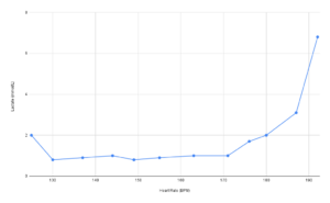
The initial dip in lactate is very common in the aerobically fit athlete as the aerobic system comes online. Once Joey’s aerobic metabolism was firing on all 12 cylinders the lactate levels stayed very low all the way out to just over 170bpm. That means that the bulk of the energy requirements for hi to run at these intensities was coming from his aerobic metabolism. Above 170bpm his lactate began to accumulate indicating that the low 170s would be his aerobic threshold. As mentioned in the podcast Joey began to add some high intensity training to his program once his aerobic base was so well developed and that was when he began to see big gains in performance.
Next on the list is the graph from a MET (Metabolic Efficiency Test) that Joey did. This kind of test is done in a lab running on treadmill. The test equipment collects the expired air and measures the amount of CO2 in it compared to the oxygen (O2) in the inspired air. The ratio of these tells us the relative amounts of carbohydrate and fat that are being used at different intensities.
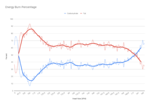
In Joey’s case the data becomes relevant starting at a heart rate of about 106pm. There you can see that the energy supply for his exercise was coming about 85% from fat and 15% from carbs. From the low 120s all the way out to the mid 160s he was using predominately fat for fuel. Only above 180 did Joey’s metabolism shift to mainly using carbohydrates for fuel. The point where the red and blue lines cross is called the “Crossover Point”. The Crossover Point being so close to his maximum heart rate is an indication that Joey needed to add more high intensity into his training. Doing that will have the benefit of making his muscles better at using carbs at these high intensities and therefore able to produce more power at high heart rates.
Lastly we will take a look at the number of grams per minute of both fuels Joey was using in that MET. This kind of information can be very useful in determining the energy requirements when you are out for many hours at a time. Joey is an ultra runner and is probably doing his races with a heart rate mostly in the rage of 150 to 170, the upper aerobic zone for him.
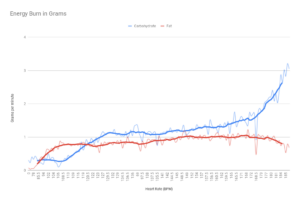
At his race intensity he’ll be using about 1 gram/min of fat and 1.25 to 1.5 grams/min of carbs. Fat has 9 kcal/gram and carbs have 5 kcal/gram. Fat stores are virtually unlimited even for a lean athlete like Joey so he will not need to refuel with fat during his long races. However, carbohydrate stores are quite limited and he will perform best if he replaces the carbs at about the same rate he is using them. That means he should be consuming about 75 and 90 grams of carbs/hour during the race.
It is worth making the effort to train your gut to handle that much carbohydrate without gastric distress during heavy exercise. Do this in training to find out what types of drinks and food you can tolerate and in what quantities. You will likely have to build slowly up to this amount.
While each of these tests is useful, if you can only do one of them, do the aerobic threshold time trial. Being a measure of your performance, and since performance is what you are trying to improve, you can begin and end with just this one simple test to track the improvement in your aerobic capacity. Do this in conjunction with an anaerobic threshold time trial explained in this article and you will be well poised to dial your training to your personal needs. https://evokeendurance.com/our-latest-thinking-on-aerobic-assessment-for-the-mountain-athlete/
With the information gained from these two tests you’ll have a pretty decent picture of the state of your aerobic system without any expense other than some sweat. It is handy that you can redo these free tests anytime to like to check on progress.
I don’t mean to imply that the other tests are not helpful. I only mean that you can get a long way with those simple performance tests. However, if you are curious and have the money to engage with a good lab to do a MET or lactate test and have the money these can help you get a bit farther down in the weeds.
Happy training!

 EvokeCast